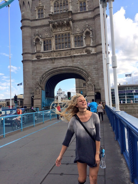
Today I traveled across the Tower Bridge, and let me tell you...it was windy. ^ But beautiful. It was an absolutely perfect day to see the bridge and the skyline of London reflecting in the waters. I got the pleasure of seeing it during the sunny day and the beautiful reflection on the water at night.
The reason I crossed over the Tower Bridge was because I was on my way to the Design Museum. The Design of the Year 2015 exhibition was going on and it was absolutely incredible. I have read about this design museum in many of my design classes and never thought I would have the pleasure of going.
Seeing all the different designs really inspired me. It is crazy what these young designers are coming up with and physically building models of. Some of my favorites included a dress made with C-3PO on it, a vest with a built-in air bag for motorcyclists and the specially designed Women magazine.
One thing that also struck me was the typography in the logo for the exhibit. The use of vertical text makes it very visually appealing, as well as the color choice. The neon orange and the hot pink work together against the white, even though the two colors clash themselves. The way the word DESIGNS is longer and then OF THE YEAR go from shortest to longest afterwards demonstrates the importance of proximity in a textual design.
Not only was the exhibit itself wonderful, but so was the talk afterwards. I found the fashion designer to be so interesting and I really enjoyed her viewpoint on how a fashion design could potentially win the design of the year in the future. Listening to how much she knew about the world of high fashion makes me want to explore the field even more when I graduate from Cal Poly.


0 comments:
Post a Comment